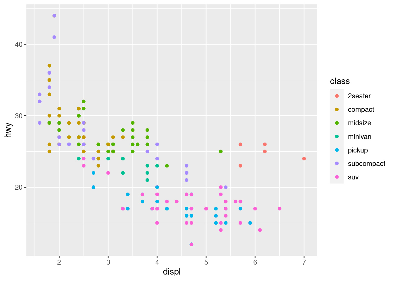
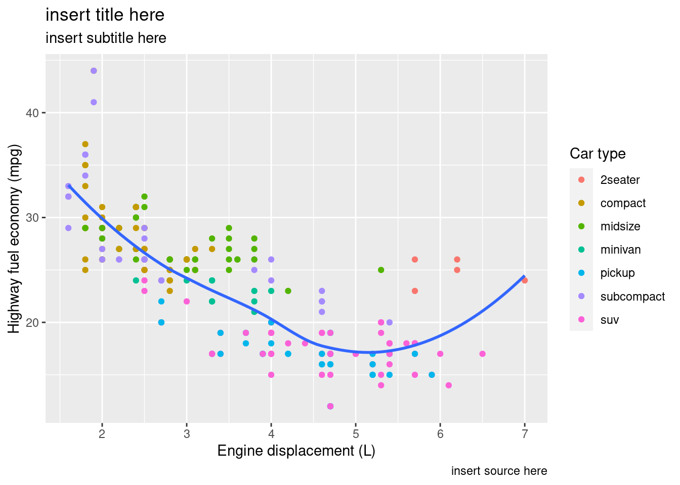
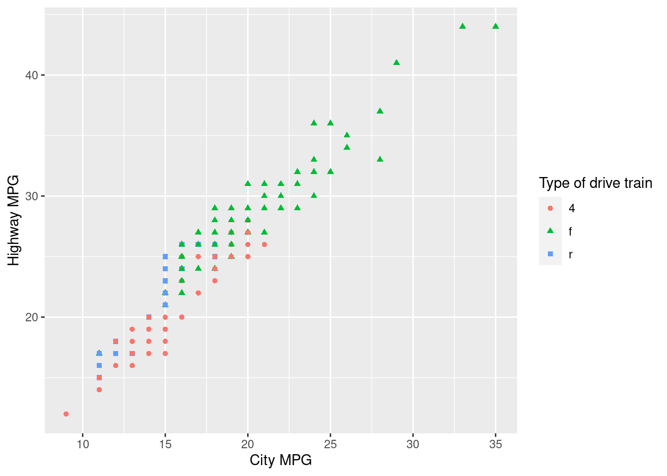
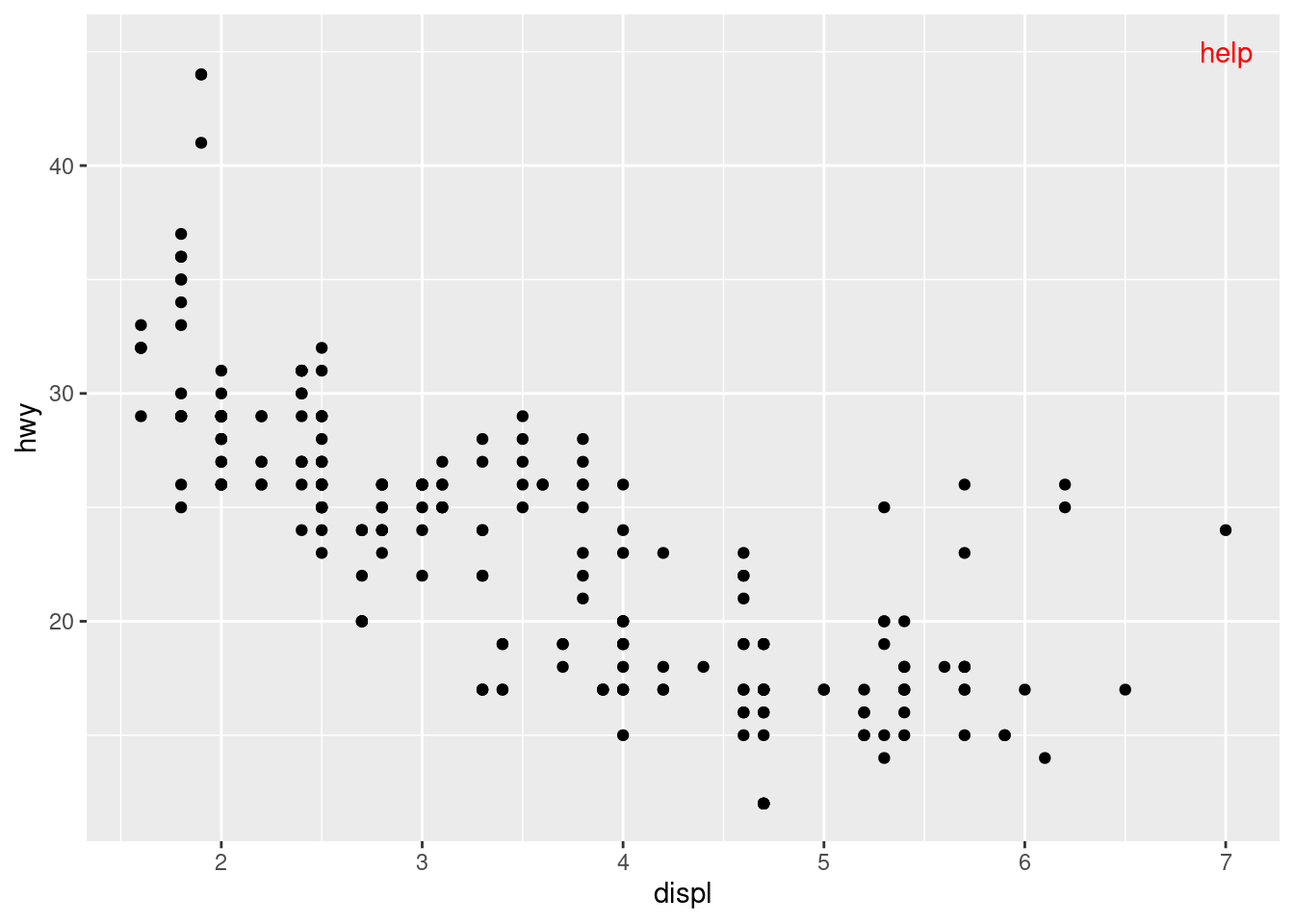
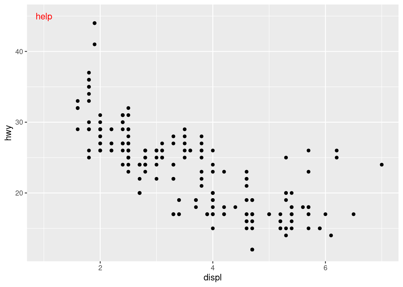
12  Communication

12.1 Notes

library(scales)
library(tidyverse)
── Attaching packages ─────────────────────────────────────── tidyverse 1.3.2 ──
✔ ggplot2 3.4.0     ✔ purrr   1.0.1
✔ tibble  3.1.8     ✔ dplyr   1.1.0
✔ tidyr   1.3.0     ✔ stringr 1.5.0
✔ readr   2.1.3     ✔ forcats 1.0.0
── Conflicts ────────────────────────────────────────── tidyverse_conflicts() ──
✖ readr::col_factor() masks scales::col_factor()
✖ purrr::discard()    masks scales::discard()
✖ dplyr::filter()     masks stats::filter()
✖ dplyr::lag()        masks stats::lag()
library(lubridate)

Attaching package: 'lubridate'

The following objects are masked from 'package:base':

    date, intersect, setdiff, union
presidential |>
  mutate(id = 33 + row_number()) |>
  ggplot(aes(x = start, y = id, color = party)) +
  geom_point() +
  geom_segment(aes(xend = end, yend = id)) +
  scale_color_manual(values = c(Republican = "#E81B23", Democratic = "#00AEF3")) +
    scale_x_date(name = "Term", breaks = seq(from = ymd("1953-01-20"), to = ymd("2021-01-20"), by = "4 years"), date_labels = "'%y") +
scale_y_continuous(
  name = "president",
  breaks = 34:45,
  labels = presidential$name
)

is you want to change the legend point colors instead of everything use this

i.e guide_legend and override.aes

ggplot(diamonds, aes(x = carat, y = price)) +
  geom_point(aes(color = cut), alpha = 1/20) +
    guides(color = guide_legend(override.aes = list(alpha = 1) ) )

to manually pick the colors

presidential |>
  mutate(id = 33 + row_number()) |>
  ggplot(aes(x = start, y = id, color = party)) +
  geom_point() +
  geom_segment(aes(xend = end, yend = id)) +
  scale_color_manual(values = c(Republican = "#E81B23", Democratic = "#00AEF3"))

crazy color change

ggplot(mpg, aes(x = displ, y = hwy)) +
  geom_point(aes(color = drv))

ggplot(mpg, aes(x = displ, y = hwy)) +
  geom_point(aes(color = drv)) +
  scale_color_brewer(palette = "Set1")

theme legend manipulation

base <- ggplot(mpg, aes(x = displ, y = hwy)) +
  geom_point(aes(color = class))

base + theme(legend.position = "right") # the default

base + theme(legend.position = "left")

base + 
  theme(legend.position = "top") +
  guides(col = guide_legend(nrow = 3))

base + 
  theme(legend.position = "bottom") +
  guides(col = guide_legend(nrow = 3))

for percentage work

ggplot(diamonds, aes(x = cut, fill = clarity)) +
  geom_bar(position = "fill") +
  scale_y_continuous(name = "Percentage", labels = label_percent())

this code is for labeling money on x axis or could change this to y axis

# Left
ggplot(diamonds, aes(x = price, y = cut)) +
  geom_boxplot(alpha = 0.05) +
  scale_x_continuous(labels = label_dollar())

# Right
ggplot(diamonds, aes(x = price, y = cut)) +
  geom_boxplot(alpha = 0.05) +
  scale_x_continuous(
    labels = label_dollar(scale = 1/1000, suffix = "K"), 
    breaks = seq(1000, 19000, by = 6000)
  )

this line of code takes away y and x axis numbers and changes the names on the legend

ggplot(mpg, aes(x = displ, y = hwy, color = drv)) +
  geom_point() +
  scale_x_continuous(labels = NULL) +
  scale_y_continuous(labels = NULL) +
  scale_color_discrete(labels = c("4" = "4-wheel", "f" = "front", "r" = "rear"))

customizes the y axis numbers

ggplot(mpg, aes(x = displ, y = hwy, color = drv)) +
  geom_point() +
  scale_y_continuous(breaks = seq(15, 40, by = 5)) 

label a specific facet

ggplot(mpg, aes(x = displ, y = hwy)) +
  geom_point(alpha = 0.1) +
  facet_wrap(~drv) +
  geom_text(data = mpg |> filter(drv == "f"), aes(label = drv), nudge_x = 1)

create a pointer in plot and explains annotate pretty well

ggplot(mpg, aes(x = displ, y = hwy)) +
  geom_point() +
  annotate(
    geom = "label", x = 3.5, y = 38,
    label = "Increasing engine size is \nrelated to decreasing fuel economy.",
    hjust = "left", color = "red"
  ) +
  annotate(
    geom = "segment",
    x = 3, y = 35, xend = 5, yend = 25, color = "red",
    arrow = arrow(type = "closed")
  )

labeling plots text

library(tidyverse)
label_info <- mpg |>
  group_by(drv) |>
  arrange(desc(displ)) |>
  slice_head(n = 1) |>
  mutate(
    drive_type = case_when(
      drv == "f" ~ "front-wheel drive",
      drv == "r" ~ "rear-wheel drive",
      drv == "4" ~ "4-wheel drive"
    )
  ) |>
  select(displ, hwy, drv, drive_type)

label_info
# A tibble: 3 × 4
# Groups:   drv [3]
  displ   hwy drv   drive_type       
  <dbl> <int> <chr> <chr>            
1   6.5    17 4     4-wheel drive    
2   5.3    25 f     front-wheel drive
3   7      24 r     rear-wheel drive 
#> # A tibble: 3 × 4
#> # Groups:   drv [3]
#>   displ   hwy drv   drive_type       
#>   <dbl> <int> <chr> <chr>            
#> 1   6.5    17 4     4-wheel drive    
#> 2   5.3    25 f     front-wheel drive
#> 3   7      24 r     rear-wheel drive
ggplot(mpg, aes(x = displ, y = hwy, color = drv)) +
  geom_point(alpha = 0.3) +
  geom_smooth(se = FALSE) +
  geom_text(
    data = label_info, 
    aes(x = displ, y = hwy, label = drive_type),
    fontface = "bold", size = 5, hjust = "right", vjust = "bottom"
  ) +
  theme(legend.position = "none")
`geom_smooth()` using method = 'loess' and formula = 'y ~ x'

#> `geom_smooth()` using method = 'loess' and formula = 'y ~ x'

nudge and rectangle around label

ggplot(mpg, aes(x = displ, y = hwy, color = drv)) +
  geom_point(alpha = 0.3) +
  geom_smooth(se = FALSE) +
  geom_label(
    data = label_info, 
    aes(x = displ, y = hwy, label = drive_type),
    fontface = "bold", size = 5, hjust = "right", alpha = 0.5, nudge_y = 2,
  ) +
  theme(legend.position = "none")
`geom_smooth()` using method = 'loess' and formula = 'y ~ x'

#> `geom_smooth()` using method = 'loess' and formula = 'y ~ x'

geom_label_repel ggrepel package adjust labels for you

library(ggrepel)
ggplot(mpg, aes(x = displ, y = hwy, color = drv)) +
  geom_point(alpha = 0.3) +
  geom_smooth(se = FALSE) +
  geom_label_repel(
    data = label_info, 
    aes(x = displ, y = hwy, label = drive_type),
    fontface = "bold", size = 5, nudge_y = 2,
  ) +
  theme(legend.position = "none")
`geom_smooth()` using method = 'loess' and formula = 'y ~ x'

#> `geom_smooth()` using method = 'loess' and formula = 'y ~ x'

great use of information

potential_outliers <- mpg |>
  filter(hwy > 40 | (hwy > 20 & displ > 5))
  
ggplot(mpg, aes(x = displ, y = hwy)) +
  geom_point() +
  geom_text_repel(data = potential_outliers, aes(label = model)) +
  geom_point(data = potential_outliers, color = "red") +
  geom_point(data = potential_outliers, color = "red", size = 3, shape = "circle open")

i think you have to create a data frame everytime

label_info <- mpg |>
  summarize(
    displ = max(displ),
    hwy = max(hwy),
    label = "Increasing engine size is \nrelated to decreasing fuel economy."
  )

ggplot(mpg, aes(x = displ, y = hwy)) +
  geom_point() +
  geom_text(
    data = label_info, aes(label = label), 
    vjust = "top", hjust = "right"
  )

12.2 Solutions

prerequisites

library(tidyverse)
library(ggrepel)
library(patchwork)

12.3 Exercises 12.2.1

  1. Create one plot on the fuel economy data with customized title, subtitle, caption, x, y, and color labels.
ggplot(mpg, aes(x = displ, y = hwy)) +
  geom_point(aes(color = class)) +
  geom_smooth(se = FALSE) +
  labs( title = "insert title here",
        subtitle = "insert subtitle here",
        caption = "insert source here",
    x = "Engine displacement (L)",
    y = "Highway fuel economy (mpg)",
    color = "Car type"
  )
`geom_smooth()` using method = 'loess' and formula = 'y ~ x'

2.Recreate the following plot using the fuel economy data. Note that both the colors and shapes of points vary by type of drive train

glimpse(mpg)
Rows: 234
Columns: 11
$ manufacturer <chr> "audi", "audi", "audi", "audi", "audi", "audi", "audi", "…
$ model        <chr> "a4", "a4", "a4", "a4", "a4", "a4", "a4", "a4 quattro", "…
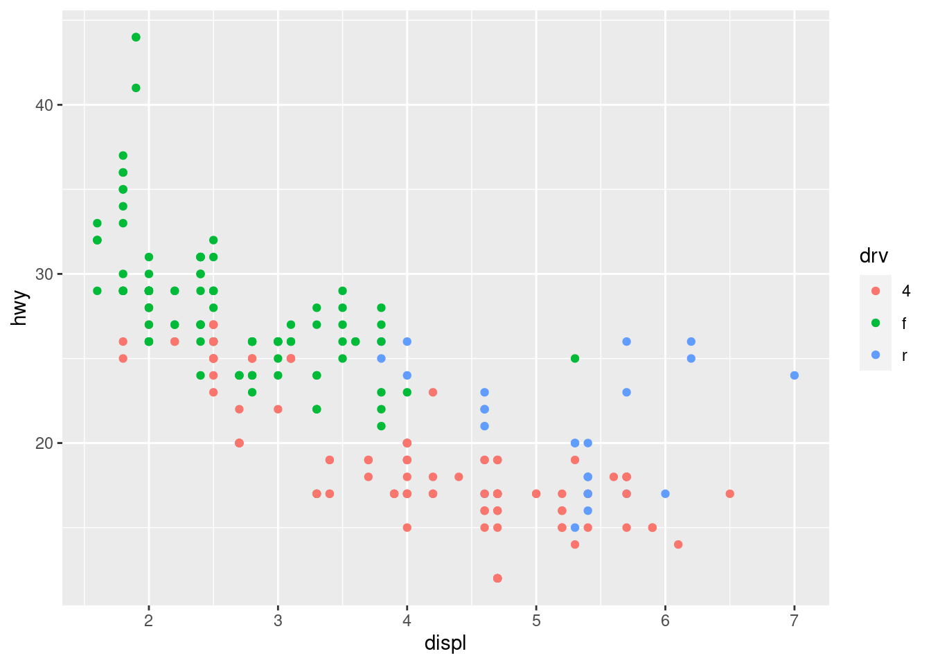
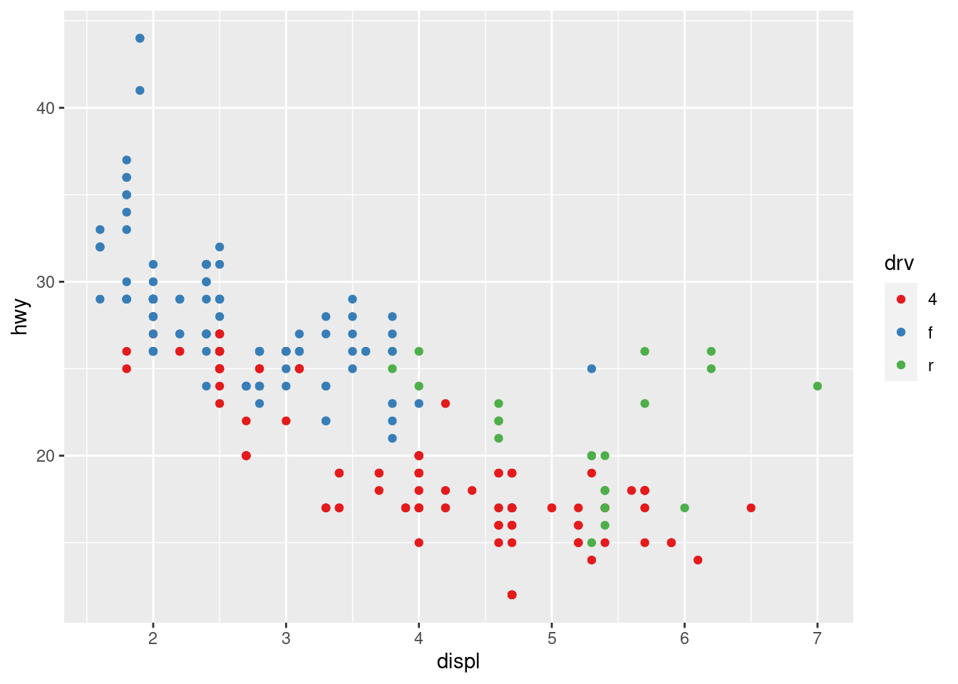
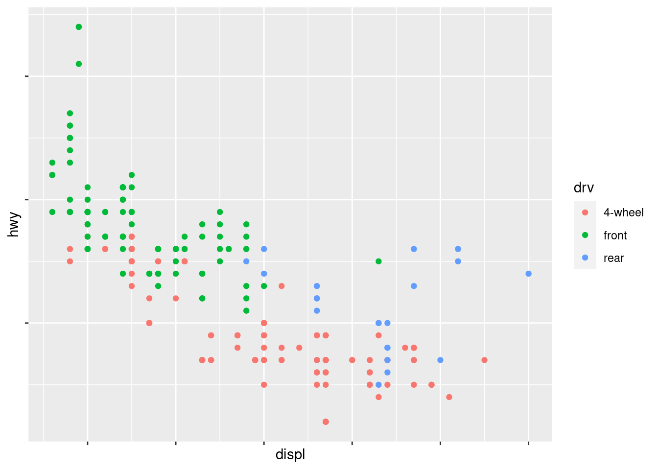
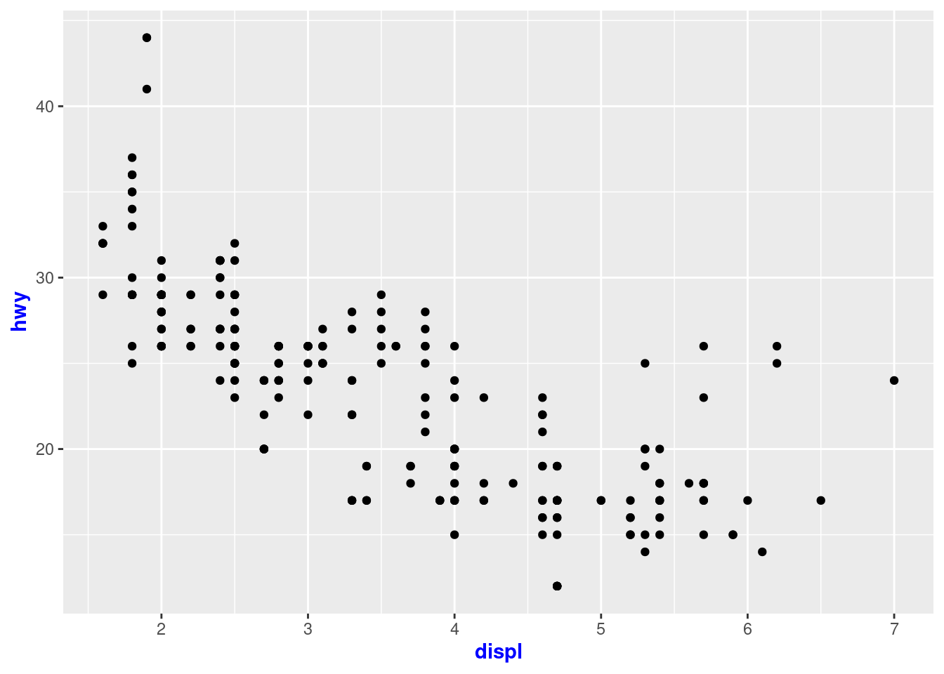
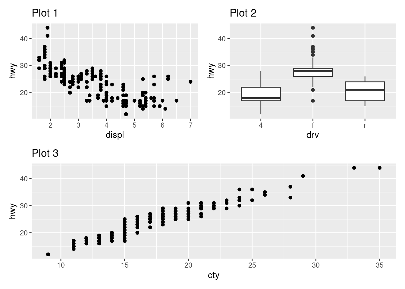
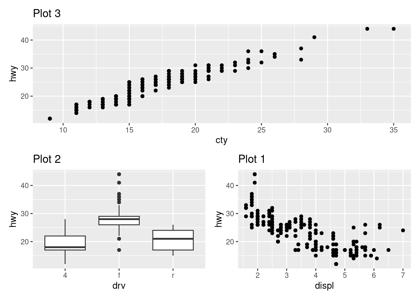
$ displ        <dbl> 1.8, 1.8, 2.0, 2.0, 2.8, 2.8, 3.1, 1.8, 1.8, 2.0, 2.0, 2.…
$ year         <int> 1999, 1999, 2008, 2008, 1999, 1999, 2008, 1999, 1999, 200…
$ cyl          <int> 4, 4, 4, 4, 6, 6, 6, 4, 4, 4, 4, 6, 6, 6, 6, 6, 6, 8, 8, …
$ trans        <chr> "auto(l5)", "manual(m5)", "manual(m6)", "auto(av)", "auto…
$ drv          <chr> "f", "f", "f", "f", "f", "f", "f", "4", "4", "4", "4", "4…
$ cty          <int> 18, 21, 20, 21, 16, 18, 18, 18, 16, 20, 19, 15, 17, 17, 1…
$ hwy          <int> 29, 29, 31, 30, 26, 26, 27, 26, 25, 28, 27, 25, 25, 25, 2…
$ fl           <chr> "p", "p", "p", "p", "p", "p", "p", "p", "p", "p", "p", "p…
$ class        <chr> "compact", "compact", "compact", "compact", "compact", "c…
mpg %>% ggplot(aes(x = cty,y = hwy,color = drv,shape = drv)) +
  geom_point() +
  labs(x = "City MPG",
        y = "Highway MPG",
        shape = "Type of drive train",
       color = "Type of drive train"
       )

12.4 Exercises 12.3.1

1.Use geom_text() with infinite positions to place text at the four corners of the plot.

ggplot(mpg, aes(x = displ, y = hwy)) +
  geom_point() +
 annotate(geom = "text",
          x = 7,y = 45, label = "help",
          color = "red")

ggplot(mpg, aes(x = displ, y = hwy)) +
  geom_point() +
 annotate(geom = "text",
          x = 1,y = 45, label = "help",
          color = "red")

ggplot(mpg, aes(x = displ, y = hwy)) +
  geom_point() +
 annotate(geom = "text",
          x = 1,y = 1, label = "help",
          color = "red")

ggplot(mpg, aes(x = displ, y = hwy)) +
  geom_point() +
 annotate(geom = "text",
          x = 7,y = 1, label = "help",
          color = "red")

2.Use annotate() to add a point geom in the middle of your last plot without having to create a tibble. Customize the shape, size, or color of the point.

ggplot(mpg, aes(x = displ, y = hwy)) +
  geom_point() +
  annotate(
    geom = "label", x = 3.5, y = 38,
    label = "Increasing engine size is \nrelated to decreasing fuel economy.",
    hjust = "left", color = "red"
  ) +
  annotate(
    geom = "segment",
    x = 3, y = 35, xend = 5, yend = 25, color = "blue",
    arrow = arrow(type = "closed")
  )

3.How do labels with geom_text() interact with faceting? How can you add a label to a single facet? How can you put a different label in each facet? (Hint: Think about the underlying data.)

geom text puts a label at each point on every facet.

ggplot(mpg, aes(x = displ, y = hwy)) +
  geom_point() +
  facet_grid(vars(drv)) +
  geom_text(label = "a", nudge_y = 6)

ggplot(mpg, aes(x = displ, y = hwy)) +
  geom_point(alpha = 0.1) +
  facet_wrap(~drv) +
  geom_text(data = mpg |> filter(drv == "f"), aes(label = drv), nudge_x = 1)

ggplot(mpg, aes(x = displ, y = hwy)) +
  geom_point(alpha = 0.1) +
  facet_wrap(~drv) +
  geom_text(data = mpg |> filter(drv == "f"), aes(label = drv), nudge_x = 1) +
   geom_text(data = mpg |> filter(drv == "4"), aes(label = drv), nudge_x = 1) +
   geom_text(data = mpg |> filter(drv == "r"), aes(label = drv), nudge_x = 1)

4.What arguments to geom_label() control the appearance of the background box?

5.What are the four arguments to arrow()? How do they work? Create a series of plots that demonstrate the most important options.

ggplot(mpg, aes(x = displ, y = hwy)) +
  geom_point() +
  annotate(
    geom = "label", x = 3.5, y = 38,
    label = "Increasing engine size is \nrelated to decreasing fuel economy.",
    hjust = "left", color = "red"
  ) +
  annotate(
    geom = "segment",
    x = 3, y = 35, xend = 5, yend = 25, color = "blue",
    arrow = arrow(type = "closed")
  )

ggplot(mpg, aes(x = displ, y = hwy)) +
  geom_point() +
  annotate(
    geom = "label", x = 3.5, y = 38,
    label = "Increasing engine size is \nrelated to decreasing fuel economy.",
    hjust = "left", color = "red"
  ) +
  annotate(
    geom = "segment",
    x = 3, y = 35, xend = 5, yend = 25, color = "blue",
    arrow = arrow(type = "open")
  )

ggplot(mpg, aes(x = displ, y = hwy)) +
  geom_point() +
  annotate(
    geom = "label", x = 3.5, y = 38,
    label = "Increasing engine size is \nrelated to decreasing fuel economy.",
    hjust = "left", color = "red"
  ) +
  annotate(
    geom = "segment",
    x = 3, y = 35, xend = 5, yend = 25, color = "blue",
    arrow = arrow(ends = "first",type = "closed")
  )

ggplot(mpg, aes(x = displ, y = hwy)) +
  geom_point() +
  annotate(
    geom = "label", x = 3.5, y = 38,
    label = "Increasing engine size is \nrelated to decreasing fuel economy.",
    hjust = "left", color = "red"
  ) +
  annotate(
    geom = "segment",
    x = 3, y = 35, xend = 5, yend = 25, color = "blue",
    arrow = arrow(length = unit(0.70, "inches"),type = "closed")
  )

12.5 Exercises 12.4.6

1.Why doesn’t the following code override the default scale?

because geom hex already fills this in you could use scale_fill instead

df <- tibble(
  x = rnorm(10000),
  y = rnorm(10000)
)

ggplot(df, aes(x, y)) +
  geom_hex() +
  scale_color_gradient(low = "black", high = "red") +
  coord_fixed()

2.What is the first argument to every scale? How does it compare to labs()?

name or palette ,you can label your x and y axis with scale_x_continous and also labs

3.Change the display of the presidential terms by:

  1. Combining the two variants that customize colors and x axis breaks.

  2. Improving the display of the y axis.

  3. Labelling each term with the name of the president.

  4. Adding informative plot labels.

  5. Placing breaks every 4 years (this is trickier than it seems!).

library(lubridate)
presidential |>
  mutate(id = 33 + row_number()) |>
  ggplot(aes(x = start, y = id, color = party)) +
  geom_point() +
  geom_segment(aes(xend = end, yend = id)) +
  scale_color_manual(values = c(Republican = "#E81B23", Democratic = "#00AEF3")) +
    scale_x_date(name = "Term", breaks = seq(from = ymd("1953-01-20"), to = ymd("2021-01-20"), by = "4 years"), date_labels = "'%y") +
scale_y_continuous(
  name = "president",
  breaks = 34:45,
  labels = presidential$name
)

4.

ggplot(diamonds, aes(x = carat, y = price)) +
  geom_point(aes(color = cut), alpha = 1/20) +
    guides(color = guide_legend(override.aes = list(alpha = 1) ) )

12.6 Exercises 12.5.1

1.Pick a theme offered by the ggthemes package and apply it to the last plot you made.

 library(ggthemes)
ggplot(diamonds, aes(x = carat, y = price)) +
  geom_point(aes(color = cut), alpha = 1/20) +
    guides(color = guide_legend(override.aes = list(alpha = 1) ) ) +
  theme_economist()

2.Make the axis labels of your plot blue and bolded

ggplot(mpg, aes(x = displ, y = hwy)) +
  geom_point() + 
xlab(substitute(paste(bold("something")))) +
  ylab(substitute(paste(bold("something"))))

ggplot(mpg, aes(x = displ, y = hwy)) +
  geom_point() +
  theme(axis.title = element_text(color = "blue",face = "bold"))

12.7 Exercises 12.6.1

1. What happens if you omit the parentheses in the following plot layout. Can you explain why this happens?

it looks like it turns the plots like vertical if that makes sense

p1 <- ggplot(mpg, aes(x = displ, y = hwy)) + 
  geom_point() + 
  labs(title = "Plot 1")
p2 <- ggplot(mpg, aes(x = drv, y = hwy)) + 
  geom_boxplot() + 
  labs(title = "Plot 2")
p3 <- ggplot(mpg, aes(x = cty, y = hwy)) + 
  geom_point() + 
  labs(title = "Plot 3")

(p1 | p2) / p3

2.Using the three plots from the previous exercise, recreate the following patchwork.

p3 / (p2 | p1)